Introducing the New Network Map in NetSense: A Modern Replacement for Weathermap
For decades, Weathermap has been the go-to tool for visualizing network topology. It was simple, useful, and let’s be honest painfully outdated. Anyone who has maintained a growing network knows exactly what I’m talking about: brittle configs, manual edits, weird rendering quirks, and that familiar fear of touching a working map because “it might break.”
At Extreme, we’ve lived with this reality for years across multiple networks and companies. And at some point, you realize the legacy tools are holding you back more than they’re helping.
So we built what we always wished existed.
Today, we’re excited to launch the NetSense Network Map - a modern, fast, clean, real-time replacement for Weathermap, designed for ISPs, IXPs, and Telcos who need a topology view they can actually trust day in and day out.
Why We Built It
Network operators today work in environments that change faster than the tools meant to support them. While traffic patterns shift hourly and infrastructure grows constantly, visualization tools remained stuck in the past.
We kept asking ourselves:
Why is the most important network visualization still produced by a tool from the 2000s?
We needed:
- A map that doesn’t break when you touch it
- A canvas that allows freedom of layout and design
- Live utilization data, not static snapshots
- Clear visualization of issues on the links
- A modern, readable interface suitable for NOC screens and engineering reviews
Weathermap simply couldn’t evolve with operator expectations. So NetSense stepped in.
Meet the New NetSense Network Map
A fresh, modern topology map built for real operators.
1. Intuitive, flexible layout control
Drag nodes anywhere. Arrange the map exactly how you want it.
No text-file editing. No manual PNG generation.
Just a clean UI that lets you shape your topology with ease.
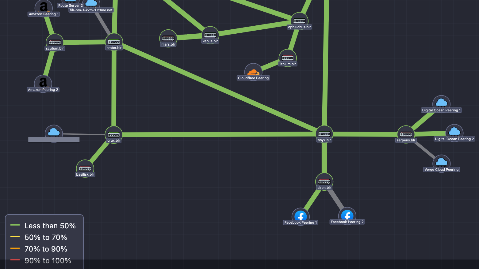
2. Real-time link utilization
Links update continuously based on live telemetry collected by NetSense.
Color thresholds reflect:
- <50%
- 50–70%
- 70–90%
- 90–100%
When traffic spikes, you see it instantly.
3. Multi-vendor and multi-technology friendly
Routers, switches, OLTs, ONTs, peers, cloud nodes, CDNs — if NetSense collects data from it, you can visualize it.
4. Alarm-aware visualization
Devices and ports with active alarms reflect their highest severity visually, making the map usable as a real operational dashboard.
5. Built for networks of all sizes
Whether it’s a compact POP or a distributed multi-site IXP, the map stays smooth, fast, and readable.
A Look at It

The map you see above is from a live production deployment at Extreme IX — not a demo, not a mock-up.
How It Works (Today)
The first version of Network Map focuses on delivering a reliable, operator-friendly experience:
- Manual topology design: You have full control over node placement and link creation.
- Live data overlay: Utilization and alarms update automatically from NetSense’s monitoring engine.
- Lightweight rendering: Optimized for clarity and performance even on large maps.
- Vendor-agnostic nodes: Use the map across Core and Transport network, Distribution network, peering, CDNs.
We intentionally started simple and strong.
Auto-discovery and topology inference are planned, but we wanted to deliver real value today rather than wait for every piece to be perfect.
What’s Coming Next (Based on Real Customer Feedback)
This release is just the beginning. Below are the major enhancements we’re actively working on — focused on real operational value, not cosmetic tweaks.
1. Deep Node Health Intelligence
Operators want the map to reflect true device health, not just position.
We’re adding:
- Node health overlays – Instant visibility into uptime, availability, and alarm status when hovering over a device.
- Automatic severity indicators – Nodes and links will show the highest severity alarm (yellow/red), enabling NOC teams to spot issues instantly.
- Error & discard markers – Visual badges for CRC errors, discards, and FCS issues — early detection for silent performance problems.
2. Smarter Link Insights
Links are more than connections — they’re the lifeblood of your network.
Coming soon:
- Bidirectional port utilization – See TX and RX simultaneously to catch asymmetry and congestion patterns.
- Traffic direction arrows – Optional flow indicators showing predominant direction — extremely useful for peering, IXPs, and content-heavy ISPs.
- Custom link speeds – For microwave, GPON, L2 circuits or any non-standard throughput setup.
3. Advanced Map Management & Team Collaboration
As networks grow, so does the need to manage maps efficiently.
We’re building:
- Map duplication & templates – Create variants: NOC view, engineering view, peering view, POP-specific view, etc.
- Multi-node selection and repositioning – Move entire clusters at once — ideal for large topologies or reorganizing regions.
- Auto-zoom framing – When you open a map, NetSense will automatically choose the best zoom level and framing, so the entire topology is instantly visible.
4. Multi-Tenant & Role-Based Features
For operators with multiple teams or customer groups:
- Map access control – Assign visibility and edit rights based on roles (NOC, engineering, peering, LCO teams).
- Geographical / logical grouping – Nodes grouped visually by city, POP, rack, OLT, or region — crucial for distributed networks.
5. Version Control, Backup & Restore
Think of this as “Git for your topology.”
- Map versioning – Save versions, roll back, experiment safely.
- Backup & restore – Critical when multiple teams collaborate or when maps get large and complex.
6. Expanded Visual Language
We’re introducing a full icon set to represent today’s networks accurately:
- CDNs (GGC, Akamai, Cloudflare, Facebook, etc.)
- Routers, switches, OLTs, ONTs, CPEs
- Virtual nodes (KVM, tunnels, gateways)
Clearer icons = faster situational awareness.
A Better Weathermap, Built for 2025 and Beyond
Weathermap played an important role for many years, and it deserves credit for that.
But networks evolved — and the tools didn’t.
The NetSense Network Map is our answer to that gap:
A clean, real-time, intuitive, flexible visualization tool built for today’s operators, and ready to grow with tomorrow’s demands.
This is v1 — but it already changes how teams see their networks.
We’d Love Your Feedback
We built this because we needed it ourselves.
Now we want to hear from the operators who will use it daily.
What matters most to you?
What would make this your primary NOC screen?
What should we build next?
Drop your thoughts, message us directly, or speak to our team.
Let’s build the modern network map the industry has been waiting for.