NetSense Network Map, Six Months In: What We've Shipped Since v1
When we launched the NetSense Network Map back in November as a modern Weathermap replacement, we ended that post with a phrase we take seriously around here:
This is v1, but it already changes how teams see their networks.
Six months later, that v1 has grown up. A lot.
We promised version control, "Git for your topology", richer icons, smarter link insights, multi-node operations, dynamic topology, and better team workflows. Most of that has now shipped. Some of it shipped in ways our customers asked for, not the way we originally pitched it. And a handful of things we never planned for landed because operators told us they needed them in production, today.
This is what continuous iteration looks like when the customers using the product are the same engineers running real ISP and IXP networks. So before we go any further: thank you to the NOC and engineering teams who filed bug reports, sent screenshots from 2 a.m. incidents, and pushed us hard on the things that weren't quite right.
Here's what's new.
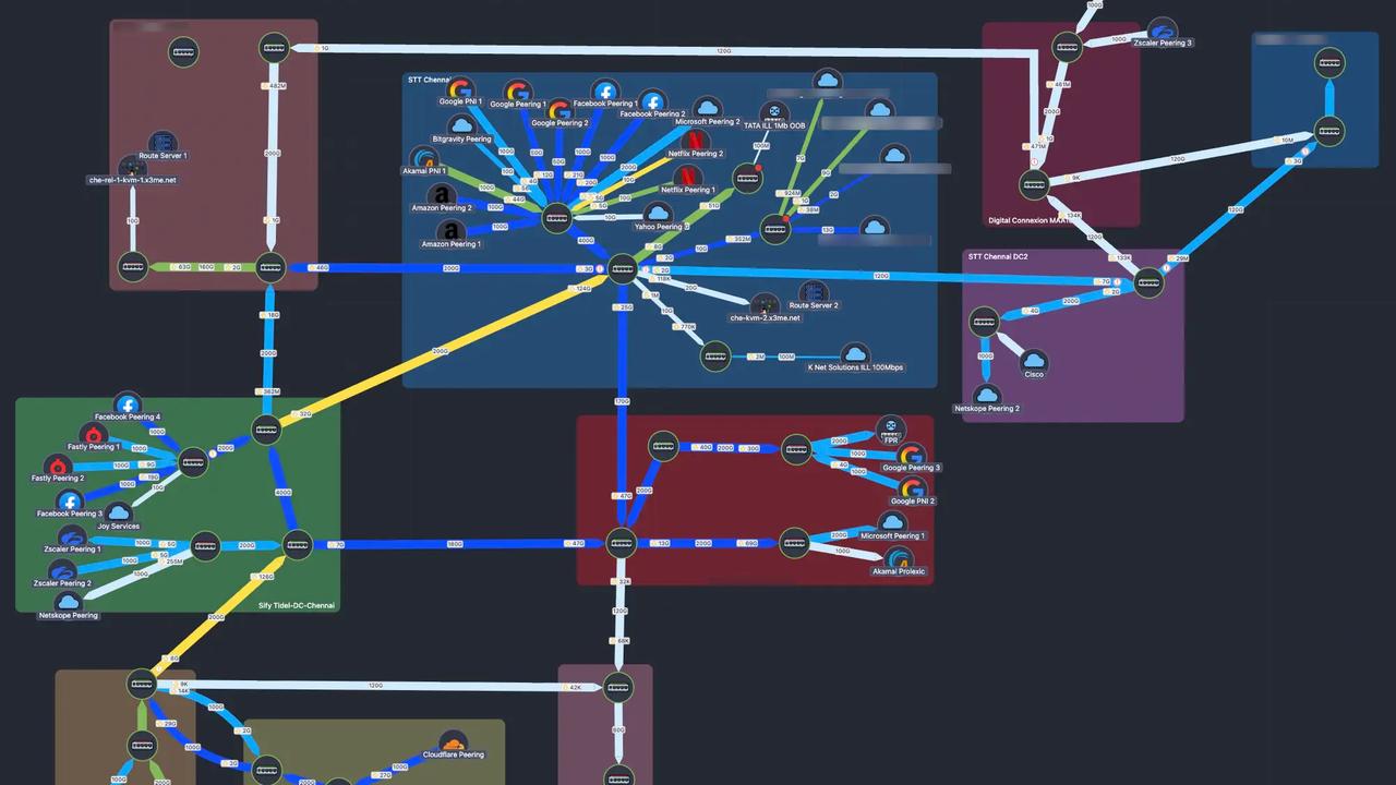
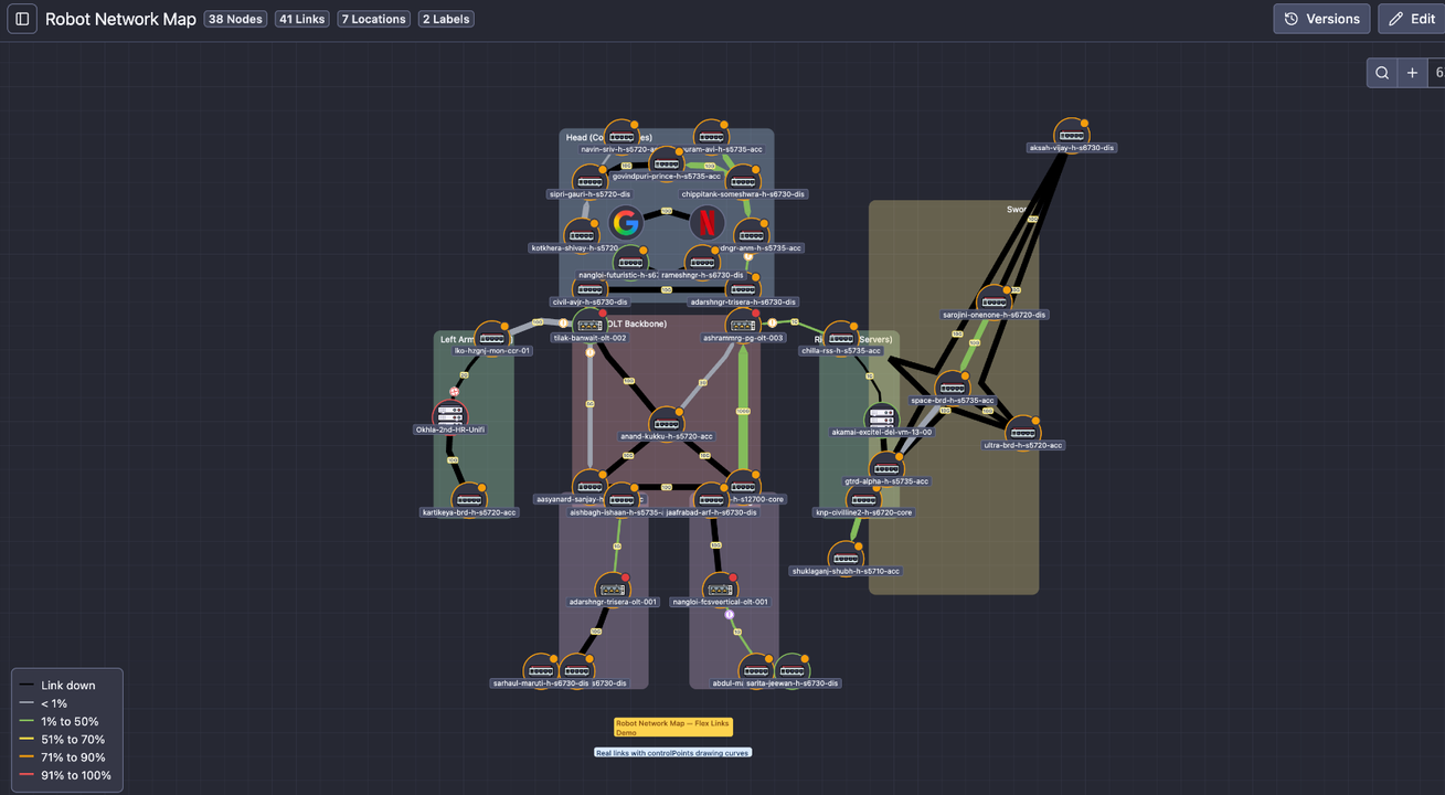
Dynamic Topology Maps: One Click From "Show Me This Device's World"
In v1 we said "auto-discovery and topology inference are planned." We're not all the way there yet (true auto-discovery via SNMP/LLDP/CDP is still on the roadmap), but we've shipped the half of the problem that delivers most of the operational value: dynamic topology generated on demand from the link knowledge you already have in the system.
Here's how it works.
NetSense now lets you maintain a single, authoritative inventory of links between your devices and ports, internal and external, through a feature we call Device Links. Once a link exists in NetSense, it's reusable everywhere: drop it into any manual map, or let it feed Dynamic Maps. There are two ways to populate it:
- Sync from Netbox (one-way). If you already maintain links and circuits in Netbox as your source of truth, NetSense pulls them in. Your IPAM/DCIM stays canonical, NetSense becomes the live operational view on top of it, and nobody re-types anything.
- Create them inside NetSense. For teams that don't run Netbox (or have links that aren't tracked there), you can create them directly in NetSense. Once created, they're first-class objects: reusable across every map, every dynamic view, every alarm impact analysis.
That data layer is what makes the headline feature possible.
Dynamic Topology MAP is generated on demand. You open a device, you ask "how is this thing connected to the rest of the network?", and NetSense draws a topology view on the fly using the links it already knows about, radiating outward from the device you're standing on. No upfront design. No drag-and-drop. Just an instant working view with full live data on it.
Why this matters: static maps have their charm. They're beautiful, deliberate, and they show exactly what you want to see. But when you're investigating a partial PON failure at 3 a.m. or trying to understand the blast radius of a switch reload, you don't have time to draw a map first. And the engineer firefighting the issue may not be the one who drew the static map in the first place. Dynamic Topology gives every engineer the same instant view, anchored on whatever device they're investigating.
Everything you'd expect from the manual maps comes along for the ride: capacity utilization, device and link status, live traffic, sidebar controls, the whole kit. And we added a few highlight gestures specifically for navigating large topologies:
- Left-click a link: it highlights and brings the connected devices forward.
- Left-click a device: it highlights with all of its associated links.
- The source device is always highlighted, so you never lose context about where the topology was built from.
- Re-arrange devices on the fly when you want to see the big picture more clearly. Positions don't persist on dynamic maps (the topology is regenerated each time), which is by design: the layout serves the moment, not the archive.
The honest framing: we made the data layer first (Device Links, Netbox sync) and a view layer (Dynamic Maps) that consumes it, instead of waiting for full auto-discovery to be perfect. The reward is that Dynamic Maps work today, on whatever subset of your network you've already mapped, and they get richer the more links you add. Auto-discovery is still coming. When it lands, it'll feed the same data layer.
Manual Maps: Now With Real Version Control
Another v1 promise: "Map versioning – Save versions, roll back, experiment safely. Think of this as Git for your topology."
That's now real.
You can save versions, roll back to a known-good layout, and (the part our customers immediately fell in love with) see a visual diff between any two versions of a map. When two NOC engineers have been editing the same map across two shifts and something looks off, the diff tells you exactly what changed.
We also added a safety net we should have had on day one: restore deleted maps. Manual maps now persist their last version even after deletion, so a misclick doesn't erase weeks of layout work. And to prevent the misclick in the first place, permanent deletion now requires you to type delete:<map_name> to confirm. Small friction, big protection against the bad day.
A Richer Visual Language
We promised "Expanded Visual Language" with full icon sets for routers, switches, OLTs, ONTs, CDNs, BNGs, virtual nodes, and servers. We've shipped multiple new batches of custom node icons since then, with more landing every few releases. If you don't see an icon for the device type you need, tell us. That's how the last three batches got prioritized.
Beyond icons, the visual layer has gotten significantly more expressive:
- Flexible links: links no longer have to be straight lines. Curve them, route them around clusters, make them readable. Manual maps can finally look like the real network diagrams your engineers draw on whiteboards.
- Animated status changes: when a node or link changes state, it blinks three times. Your eye catches it across the room on a NOC screen.
- Notification stack with sound alerts: every status change gets logged as a stacked message in the bottom-right corner, with optional sound. Combined with the animation, NOC teams now get two reinforcing channels for the same event.
- Down-device link colorization: when a device goes down, every link connected to it adopts the down-link color. Impact becomes visually obvious without tracing each link by hand.
- Direction-aware traffic indicators: the old textual "I/O" labels have been replaced with proper up/down arrow icons. Small change, huge readability improvement on dense maps.
- Improved tooltips: link hover now shows Point A and Point Z device → port → description in a properly sized tooltip, with a 500 ms hover delay so you don't get tooltip-spammed when scanning the map.
Operational Depth Inside Every Link
The original v1 map showed you utilization. The current map tells you a story.
Chart annotations mean every gap in a chart now has a reason: red background for "device was down", yellow for "port was down", with a tooltip describing exactly what happened. No more staring at a missing data segment wondering whether it was a polling issue, a real outage, or something stranger.
We've extended the same logic into the link tooltips themselves: device-down and port-down events now appear as annotations inside the live traffic chart that pops up when you hover a link. The map stops being a picture and starts being a timeline.
For ports with optical, error, and discard concerns:
- Hover over the error or discard icon on a node and you get a chart of current values plus historical data. Early detection for silent performance problems without ever leaving the map.
- Right-click a link and you can open Point A or Point Z port details, fetch live traffic on either side, or open live traffic in a new tab so you can monitor multiple interfaces in parallel.
- Right-click on empty canvas to add nodes; right-click on a node to add a link to or from it. The whole map authoring loop now lives at the speed of right-click.
Power-User UX: It Got A Lot Faster
Once a tool starts being used hundreds of times per day, every friction point compounds. We hunted them down.
- Ctrl+F / Cmd+F node search: type a hostname or IP, the map focuses on that device. Instant.
- Headless / fullscreen view: perfect for NOC wall displays. Just the map, no chrome.
- Smoother zoom with view persistence and a fit-to-screen option. Open a map, get the framing you had last time, or one click to see everything.
- Sidebar controls for one-click visibility toggling.
- Manual ordering of maps in the sidebar, so the most-used maps stay where you put them instead of getting reshuffled by creation date.
- Multi-node selection and bulk repositioning: grab a cluster of nodes and move them as one. For large topologies or full regional reorganizations, this is the difference between five minutes of work and an hour.
- Labels: drop text annotations anywhere on the map to mark zones, sites, or anything that needs a name without being a node.
- Sidebar chrome: collapsible, resizable, with icons in collapsed mode, so the map gets the space it deserves.
None of these are headline features. All of them disappear into the background once you have them, which is exactly the point.
A Quick Note on Netbox
The Device Links data layer described above is the same one that powers our Netbox integration. We bumped Netbox compatibility to version 4.5 in early May, so teams already on the latest Netbox release won't hit a wall when they connect it to NetSense.
Two Networks, Zero Weathermap
When we wrote the v1 post, "modern Weathermap replacement" was a positioning claim. Six months in, it's a measurable fact in two production networks.
Extreme IX and Excitel, the IXP and the FTTH ISP that have lived inside the Network Map's iteration loop from day one, have now fully retired Weathermap. Not "running both side by side." Not "Weathermap is still up for the old maps." Decommissioned. The NetSense Network Map is the daily driver for both NOCs, used during peering reviews, during incidents, on the wall displays, and as the canonical topology view shared between engineering and operations. It's the screen people look at first.
Three more operators are mid-migration as we publish this, moving years of accumulated Weathermap configs into NetSense maps and Device Links, often as a forcing function to clean up link inventories that had quietly drifted from reality. We're working with each of them directly, because migrating away from a tool you've used for a decade is a real project and we'd rather get it right than rush it.
It's also the feature that pulls the most questions on demo calls. When we show NetSense end-to-end (OLTs, PON, alerting, TR-069, the works), the moment we open a live Network Map, the meeting tone shifts. Engineers lean in, ask about flexible links, ask about the diff view, ask what happens when a device goes down. That curiosity is the real signal: this is a category of tool people have been quietly unhappy with for years, and they recognize when something has finally moved.
If your team is still maintaining Weathermap configs in 2026 and wondering whether the migration is worth it: the two networks who already did it would tell you yes.
So What's Next?
The November 2025 roadmap had six categories. Most of them have shipped at least partially. A few are still in flight:
- Map duplication and templates (NOC view, engineering view, peering view, POP view). Actively being built.
- Map access control with roles for NOC, engineering, peering, and LCO teams. Design phase.
- Geographical and logical grouping: visually clustering nodes by city, POP, rack, OLT, or region for distributed networks.
- Custom link speeds for microwave, GPON, L2 circuits, and any non-standard throughput.
- True auto-discovery via SNMP/LLDP/CDP, the missing half of the topology story, which will feed the same Device Links data layer Dynamic Maps already runs on.
These are the next things on the wall. As before, the order will get rearranged based on what real operators actually need first.
A Quick Word on How This Gets Built
The reason the Network Map has moved this fast is that almost every change above came from a real operator hitting a real wall in production, most of them inside our reference deployments at Excitel and Extreme IX, plus the broader set of ISPs running NetSense across India, Europe, and beyond.
That's the loop we're committed to: ship something useful, listen hard, iterate visibly, and publish the changelog so you can tell whether we're keeping our word. We promised continuous improvement at v1. This post is what continuous improvement looks like in practice.
There's a lot more in the pipeline. If there's a workflow your team keeps doing the hard way (on the map or anywhere else in NetSense), tell us. The fastest path from a workaround to a feature has always been a customer email.
Ready to see it in action?
The current Network Map is live in every NetSense deployment, including the free-forever tier up to 1,000 nodes. If you're still living with Weathermap configs or paying enterprise licenses for something half as flexible, book a live demo. We'll walk you through the dynamic topology, the version diffs, the link tooltips, and everything else, on a real production network.
And if you're already a NetSense customer: refresh the Network Map page. There's probably something new there since the last time you looked.